


The Origins of BMW and the Birth of Its Logo
The BMW logo stands among the iconic symbols of the automotive industry. The blue-and-white circular logo embodies elegance, performance, and tradition, but its design is rooted in much more than aesthetics. It all began in 1916 when Bayerische Flugzeugwerke (Bavarian Aircraft Works) was founded in Munich. The company was later renamed Bayerische Motoren Werke AG, or simply BMW. In its early years, BMW specialized in producing aircraft engines, a factor that played a crucial role in the development of the logo.
After World War I, BMW had to adapt to a ban on military aircraft engine production, leading the company to explore new directions. As it transitioned from aviation to manufacturing motorcycles and cars, the logo continued to bridge its aviation roots with the company’s new focus.
![]()
Symbolism and Design: Inspired by the Bavarian Flag
The BMW logo was created in 1917, as the company sought a unified visual identity under its new name. The design drew inspiration from the Bavarian flag, with its blue and white colors. The quarters of the circular logo alternate between blue and white, a direct reference to BMW’s Bavarian origins. However, German laws at the time prohibited companies from using state symbols directly, so BMW’s logo became a stylized representation of the Bavarian flag.
The logo’s simplicity and timeless quality align with BMW’s philosophy—producing vehicles that are practical, functional, and stylish. Though the logo has undergone minor refinements since its inception, it has always retained its iconic circular shape and color scheme, defining BMW for over a century.
The Propeller Myth: How Aviation Symbolism Shaped the BMW Logo
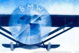 Many people today believe the BMW logo represents an airplane propeller in motion, thanks to its blue-and-white combination resembling a spinning propeller against the sky. This myth gained traction largely due to BMW’s marketing campaigns in the 1920s. In 1929, BMW used the logo in promotional material alongside an airplane propeller to highlight its new aircraft engine, leading the public to associate the logo with a spinning propeller.
While this interpretation became popular, most historians agree that the true meaning of the logo lies in its Bavarian flag origin. BMW has never officially denied the propeller myth; in fact, the company has leveraged it in various campaigns, strengthening the brand’s aviation-linked image. This symbolism has become so ingrained that today it’s often associated with BMW’s DNA and its emphasis on performance, technical precision, and innovation.
Logo Modernization and Tradition Preservation
Since its inception, the BMW logo has seen several updates, while its core design has remained consistent. In 2020, BMW introduced a new, modernized version of the logo, which is minimalist and tailored for the digital age. The new logo features a transparent background instead of the traditional black fill and a flattened design, making it more compatible with online and digital applications.
This update, however, left the iconic blue-and-white elements untouched, maintaining continuity with the original design. By doing so, BMW aimed to show that it remains true to its values and traditions while adapting to modern trends. The transparent logo represents a fresh, futuristic approach, while the Bavarian colors honor the company’s historical roots.
Thanks to its simplicity and style, the BMW logo remains one of the most recognizable symbols in the automotive world.
Source: Wikipedia, BMW


Leave a Reply